Brochures deliver a powerful impact despite their small size. With their captivating visuals, persuasive messages, and ability to convey loads of information, brochure design is a cost-effective and portable way to offer concise information. They also make it easy to share with others and provide measurable results.
They are a cost-effective marketing tool for companies and can generate significant sales. Additionally, brochures can be utilized for brand awareness, navigation instructions, and to provide information.
They tell a story to your target audience that paints a beautiful picture and allures them to use your products or services.
In today’s world, we have many tools and techniques to create a decent brochure using different templates that can work just right. But just right is not enough. We need a professional graphic design that is impactful and noteworthy.
Brochure designing is a process that should produce enticing content to guarantee conversion.
So, how should we do it? Well, you can start using brochure designing tools without templates so that you can have more creative freedom and flexibility.
Understandably, brochure designing from scratch can seem daunting, but by following these 10 easy and effective steps created by practical and industry experts at Dad of Ad, you can create a professional, creative, and alluring brochure that will stand out from the competition.
Our graphic design services provide a complete solution for any kind of design needs. To access our services, click here.
Let’s go through them one by one:
Determine the Objectives of your Brochure Design
a) Identify the purpose of your brochure.
You need to foresee the outcome of the brochure being produced and understand the purpose of its content. It can be about awareness, sales, information, navigation, etc. The most common use for a brochure is to promote your product and create hype for it. Additionally, consistency must be maintained in accordance with your defined purpose.
b) Analyze your target audience.
It’s not about you! Creative brochure designing is not about presenting your thoughts and ideas but carefully analyzing market demands, your audience’s psychographics, and what influences them the most. Align your creative approach with this analysis, and then you are ready to brainstorm ideas.
c) Clarify your call-to-action (CTA).
This is an essential part of any promotional type of brochure. Add a CTA to your brochure. It can be a phone number, site, or store visit prompt, and if it’s a digital brochure, you can always add a link to your website or a button embedded in the PDF or email.
Ad: Dad of Ad’s professional graphic design services provide end-to-end support for a compelling and creative brochure. To access its services, click here.
Now that we are clear with the objective, let’s hop on to the next step of brochure design.
Choose a Brochure Type
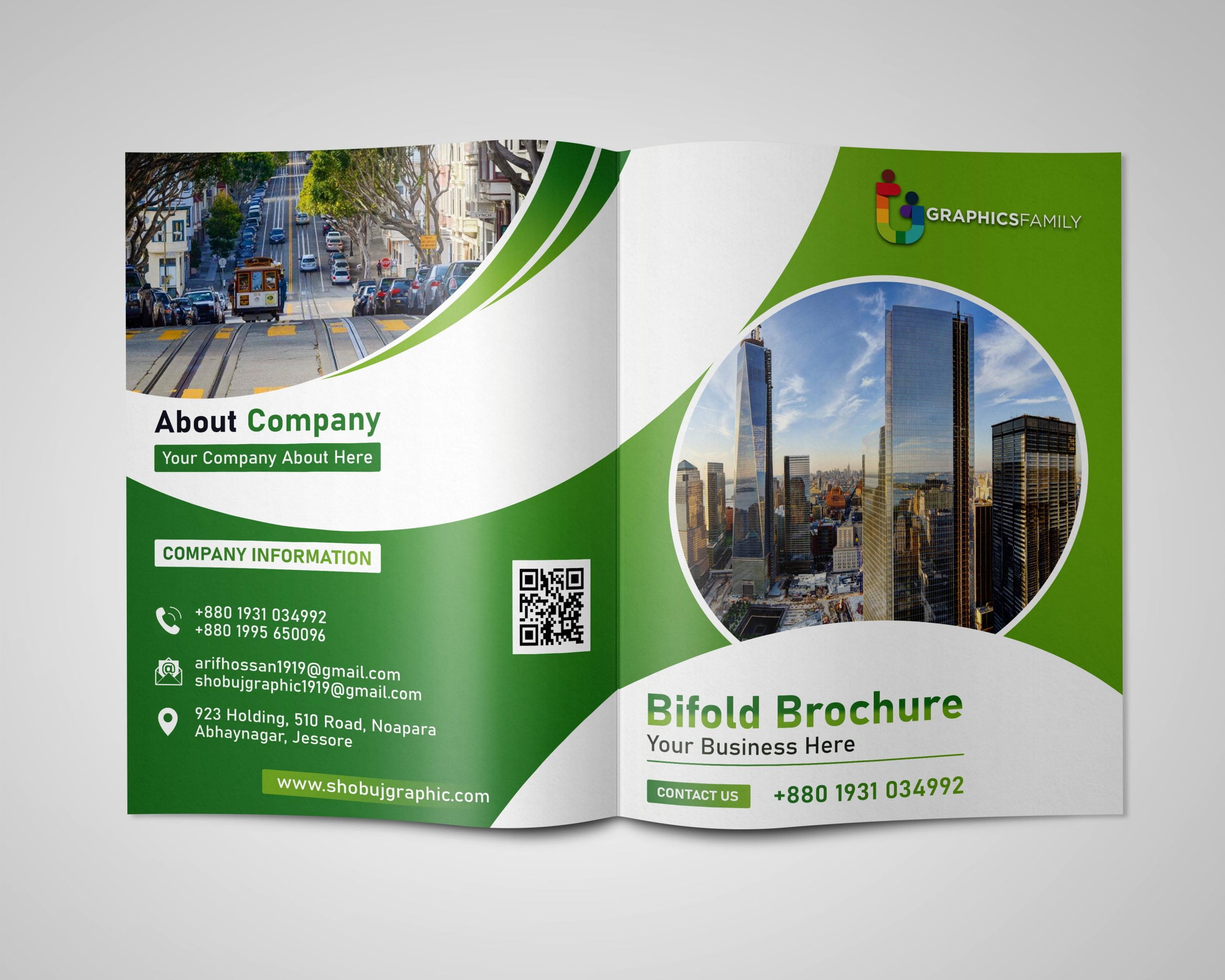
1) Bi-fold brochure – Simple and compact.
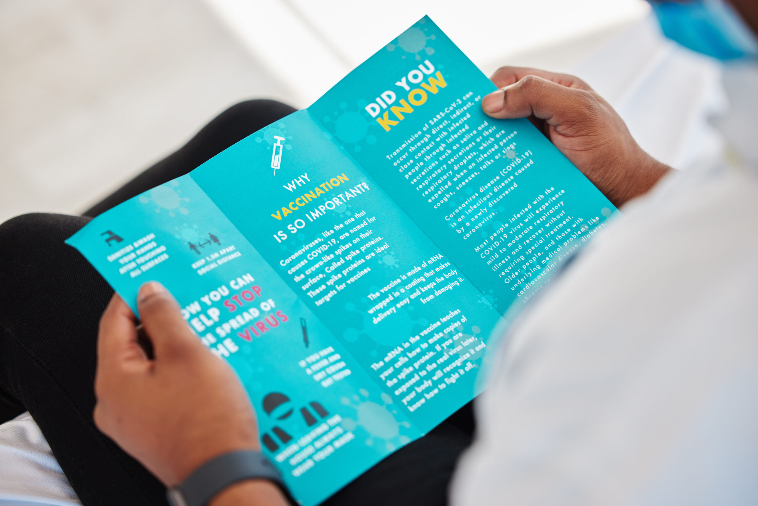
2) Tri-fold brochure – A classic design with space for more content.
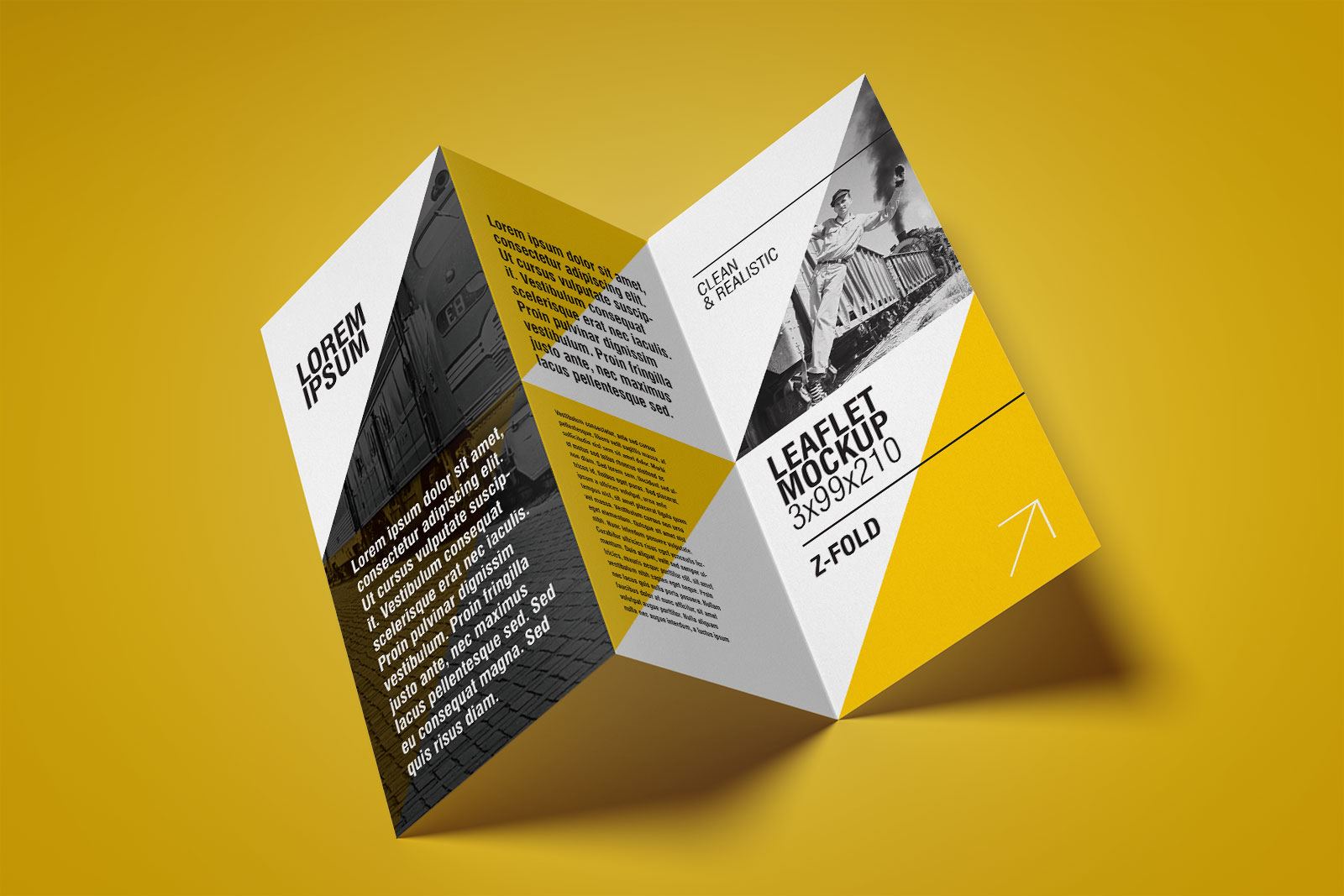
3) Z-fold brochure – A unique fold that opens up like an accordion.
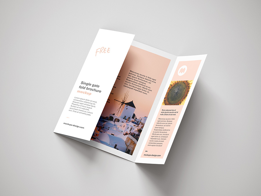
4) Gatefold brochure – Opens up like a double door to reveal a central image.
5) Double gatefold brochure – For maximum wow-factor, it opens up into four panels.
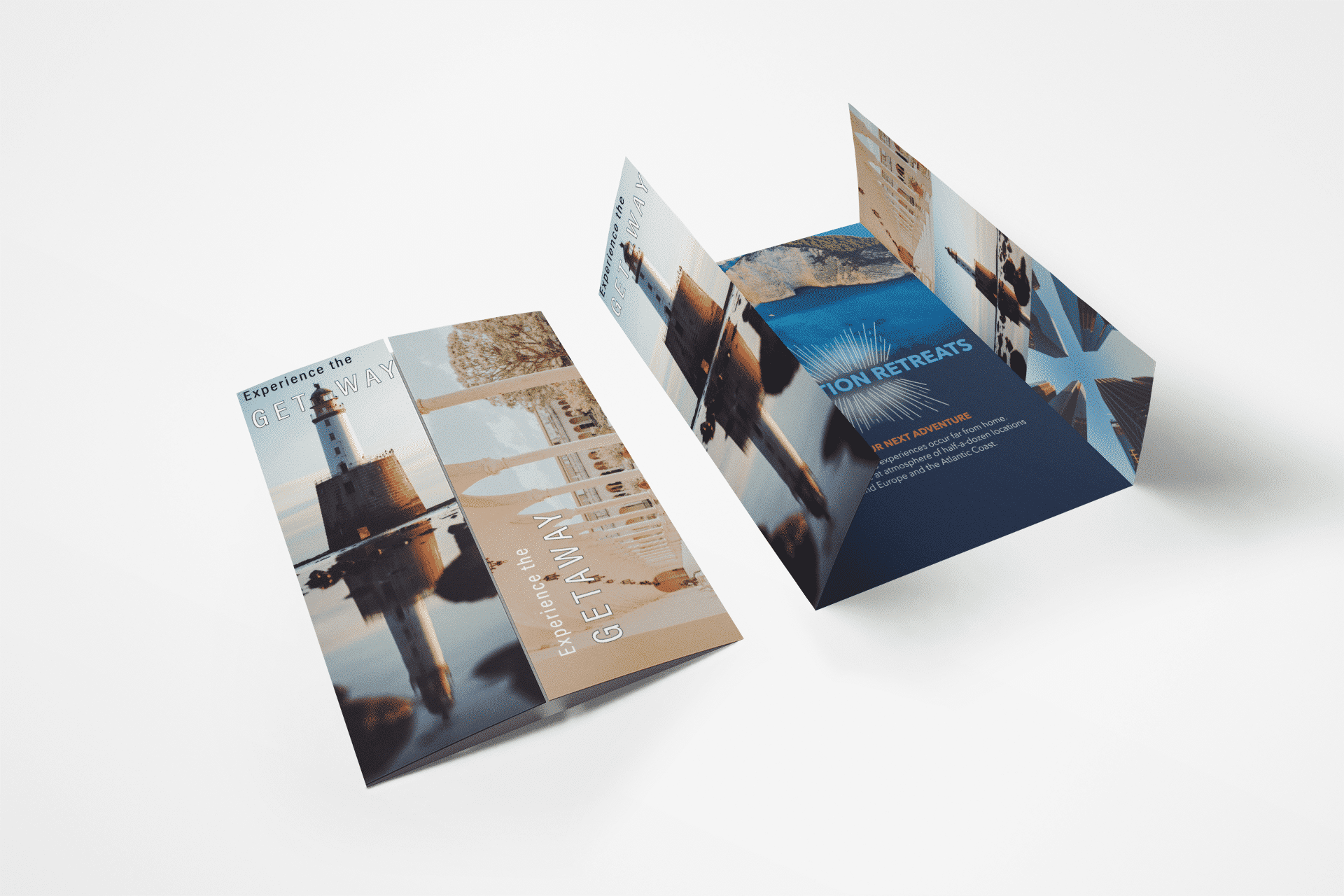
Consider the Layout and Format
a) Orientation (portrait or landscape):
In brochure designing, the standard orientation is portrait as it showcases the most content in a significantly better space. So, in most cases, portrait orientation will work the best; however, depending on the type of content to be included in the brochure, you can choose your orientation. A quick tip – If you need to highlight a unique aspect of your product that is needed to be viewed in a wider form, use landscape orientation, as it will have a greater impact on the viewer.
b) Page size and margins:
As a standard in brochure designing, A4 size is used for making a regular tri-fold or bi-fold brochure. However, it depends on your design choices and how much you want to include in one single page of your brochure. It is recommended to use A4 size pages as it is easier to print and keep margins in such a way that the brochure doesn’t feel cluttered.
c) Bleed and safety zones:
If brochure designing is done properly, you won’t have to worry about bleeding. You need to ensure that the text is not hidden when the brochure is folded along the lines. Proper placement of text, images, and even margins is important to avoid bleeding and safety zones.
d) Grid systems and alignment:
Make sure after making such a beautiful brochure, technical errors don’t ruin the fun.
Ad: Dad of Ad’s professional graphic design services provide end-to-end support for a compelling and creative brochure. To access its services, click here.
Choose the Right Color Scheme for your Brochure Design
1) Consider your branding colors:
It is important for any brand to create an identity that people can recognize to succeed in the market. Though there are so many aspects to go through, one of the important ones is its color scheme. So, brochure designing should be done in accordance with your brand’s colors, after understanding your brand’s identity.
2) Primary, secondary, and accent colors:
Your brochure should always stand out. If you effectively use your primary and secondary colors, then even if your brochure ends up in a competitive environment, say, a store rack, the first brochure picked out of the bunch will be yours. You can play around with different shades of your branding colors, but make sure that the intent should be to look notable. Give the topping of befitting accent colors, and you are good to go.
Select Appropriate Images and Graphics for your Brochure Design
a) Choose high-quality visuals:
In earlier times, brochure designing was done through hand-drawn services instead of digital graphic design services, and so it was limited in terms of approaches. But today, in accordance with your brand guidelines, you can do multiple kinds of edits, add pictures of your product or use AI to generate plagiarism-free accurate images. So, it’s relatively easy now to create a creative brochure.
b) Use images that support the message:
So, depending on the brochure’s content and what it is supposed to say, you need to add images that reflect your message.
c) Create original designs:
Any graphic design services will say that in brochure designing, authenticity and originality bring out the best appeal for your brochure. So, ensure you are not using any image that can lead you to copyright or plagiarism issues. If creating images for your visual representation is difficult, you can use AI such as mid-journey, fotor, etc. Note that you can not use AI-generated images for your product visualization.
Create Captivating Text and Headlines in your Brochure Design
1) Write clear and concise copy:
Any good graphic design services would recommend that apart from aesthetics, imagery, and design, another important aspect of any brochure is how well you convey your message. To create a desire in your audience’s heart to try your product, you need to create a compelling yet concise copy that delivers your message according to the objective of your brochure designing.
2) Use headlines, sub-headings, and bullet points:
Gone are the days of writing big paragraphs in every piece of content you make. Due to the declining attention span of human beings, it is recommended to use bullet points, to-the-point messages, and headlines. We recommend you not to write huge paragraphs unless it’s an educational or informational brochure designing.
3) Be persuasive and use action-oriented language:
There is so much that you can do by just effectively using the right words. You need to make sure that the way you convey your message through your brochure is compelling enough to persuade them to take action as directed by the message. In brochure designing, CTAs have a high impact on conversion. Any professional graphic design has its elements as per the objectives and brochures most common goal is persuasion. So make sure to add adequate CTAs in your brochure. Graphic design services like Dad of Ad have experts who can create persuasive and creative brochures.
4) Take inspiration from various sources:
Inspiration can come from various sources apart from brainstorming. You can interact with your colleagues, mates, and friends and ask for their input. You can also go through different competitors’ material to understand what works and what doesn’t. But make sure that you only take inspiration from them instead of creating a modified version of their content.
Ad: Dad of Ad’s professional graphic design services provide end-to-end support for a compelling and creative brochure. To access its services, click here.
Incorporate Your Brand Elements in Your Brochure Design
a) Select appropriate fonts that reflect your brand:
We have already explained in the fourth step how important your brand’s color scheme is for your brochure designing. Following that, it is also necessary to include fonts following your brand identity.
b) Use logos and unique imagery consistent with your brand:
Here, you need to take care of optimal brand identity usage. You are not supposed to put your logo everywhere but in a good amount and wherever necessary. Also, to add to the point in the fifth step, follow the guidelines of your brand for photography of your product or services. It’s just the icing on the cake.
c) Ensure consistency in your design and messaging:
It goes without saying that throughout your brochure, you must ensure consistency in quality, adding branding elements, the tone used, design choices, and all other aspects. Make sure that you don’t go wrong with this in your brochure designing process.
Pay Attention to Details
1) Proofread your text to eliminate errors:
Proofread it yourself and ask other peers. It’s important that this document, which will be distributed directly to your prospective customers, doesn’t contain any grammatical or spelling errors.
2) Ensure proper formatting and consistency:
It covers your designing aspects. Ensure that the format & structure of the content is consistent throughout your brochure designing process.
3) Use high-resolution images and graphics:
Be it a digital brochure or a printed one, using high-resolution images paints a clearer picture of the product or service you are promoting to your target audience. If you want to decrease the size of the digital brochure, you can use different image compression tools, which help keep the quality intact while reducing the size significantly.
A little feedback can help a lot
a) Ask for feedback from different people:
Share your brochure design with team members or colleagues for feedback. You can use any of the graphic design services if you want to take feedback from them as well.
b) Consider feedback objectively and make necessary changes:
Feedback can either make or break your brochure. Taking an objective look at the feedback can help you decide which changes are worth making and which are not.
c) Test the brochure with your target audience:
Test audiences can genuinely make a difference in the reception of your brochure. The feedback your test audience can provide will help you make effective improvements.
Ad: Dad of Ad’s professional graphic design services provide end-to-end support for a compelling and creative brochure. To access its services, click here.
Print and Distribute
1) Select a professional printing service to print copies:
You should always opt for quality printing services while printing a physical copy. It might cost extra, but it gives you significant durability and design aesthetics.
2) Consider printing options like paper stock, finishes, and folding:
Have thorough research and create multiple sample copies with different papers, finishes, and qualities to find the best one that impacts your customers most.
3) Develop a distribution plan to reach your target audience:
Since there are so many channels in today’s market, you can always choose how you want to share your brochure for maximum reach. Or you can reach out to us, we can help you with quality brochure designing and maximize reach.
Conclusion
Following these 10 easy steps, you can create a professional and visually appealing brochure that effectively communicates your message to your target audience. Designing a creative brochure from scratch doesn’t have to be complicated. It does require a little extra care, but it’s all worth it when you design an effective brochure at the end of the process.
Ad: Dad of Ad’s professional graphic design services provide end-to-end support for a compelling and creative brochure. To access its services, click here.
While you can make an effective brochure, we would still recommend that if you need to make sure your brochure stands out from the competition, you can approach Dad of Ad’s professional graphic design services, as it is a marketing and advertising company that creates personalized brochures tailored to your needs while keeping the objective at the center point.
FAQs
Q: Do I need to hire a professional designer to create a brochure?
A: It is always recommended if it’s an important dimension of your brand. Surely, by following these steps and using design software like Adobe InDesign or Canva, you can create a brochure on your own. However, if you have more complex design needs, it may be worth hiring a professional. Dad of Ad’s graphic design services is one of the top-tier complete design solutions. You can approach us any time of the day.
Q: How many colors should I use in my brochure design?
A: It’s best to stick to a primary color palette of 2-3 colors, including accent colors. Avoid using too many colors, which can make your design look cluttered and overwhelming.
Q: How do I know which type of brochure to use?
A: The type of brochure you choose depends on the amount of content you want to include and how you want to present it. Bi-fold and tri-fold brochures are the most common types, but z-fold and gatefold brochures are great for showcasing larger images. The double gatefold brochure is useful for telling a story with images and text. Still, if you have confusion, try reaching out to us. Our professional graphic design services can give you end-to-end assistance.
Q: Why is text formatting important in a brochure design?
A: Proper text formatting increases readability. Using bullet points, headings, and subheadings is essential to break down longer sentences into digestible chunks, making scanning through them easier for your audience.


Leave a Reply