Are you looking for the best UI/UX design examples?
User interface (UI) and user experience (UX) design determine how your website looks, feels, and works for your visitors. According to a study by ResearchGate, 94% of individuals think that a website reflects the brand reputation and the brand comes from how its website looks. Hence, a remarkable UI/UX website design can make your brand stand out from the crowd and increase your conversions.
But how do you achieve an impactful UI/UX design? And where can you find the best UI/UX design examples to take inspiration from for your own websites or apps? In this blog, we will answer these questions and show you 10 of the best UI/UX design examples that you can learn from.
At Dad Of Ad, we are passionate about creating exceptional UI/UX designs and are always on the lookout for the latest trends and best practices in the field. We will be sharing our insights and 10 best UI/UX design examples with you below.
Through the best UI/UX design examples, you will be able to get inspired and craft user-friendly, attractive interfaces and experiences for your target audience. But let’s first find out why UI/UX design is important!
The Importance of UI/UX Design
UI/UX design is not just about making your website look good. It’s also about making it work well for your users. According to a study by Adobe, 38% of people will stop engaging with a website if the content or layout is unattractive. Moreover, 88% of online consumers are less likely to return to a website after a bad experience.
On the other hand, a good UI/UX design can have a positive impact on your business. For example, a study by Forrester Research found that every $1 invested in UX can result in a $100 return. Another study by McKinsey & Company found that companies that excel at UX design perform better than their competitors in terms of revenue, customer satisfaction, and loyalty.
But what really makes a UI/UX design good and what are some best UI/UX design examples? Let’s find out.
What makes a UI/UX design really good?

Here are some characteristics that the best UI/UX design examples implement:
Simplicity
A good UI/UX design should be clear, concise, and easy to use. It should avoid unnecessary elements and focus on the essential features that your users need.
Consistency
The best UI/UX design examples should maintain a harmonious look and feel across your website. It should use the same colors, fonts, icons, and styles throughout all pages and elements.
Responsiveness
A good UI/UX design should adapt to different devices, screen sizes, and orientations. Ensure that your website is accessible and usable on mobile phones, tablets, laptops, and desktops.
Interactivity
The best UI/UX design examples should provide feedback and guidance to your users. It should use animations, transitions, microinteractions, and other effects to enhance the user experience and engagement.
Personalization
The best UI/UX design examples should cater to the preferences and needs of your users. Use data and analytics to customize your website content, layout and functionality according to your users’ behaviors, location and history.
But what are the current trends that the best UI/UX design examples implement? Read on to find out.
What are Some Current Trends in UI/UX Design?
UI/UX design is an evolving field that constantly adapts to the changing needs and expectations of users and businesses. Here are some of the current trends that the best UI/UX design examples implement:
Dark mode

Dark mode is a popular option that allows users to switch to a dark background and light text on your website.
3D graphics
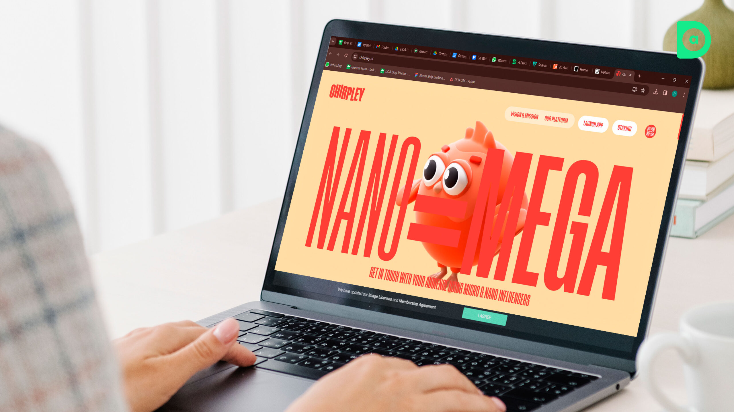
3D graphics are a powerful way to create realistic visuals that add depth, dimension, and movement to your website.
Voice UI

Voice UI enables users to interact with your website using voice commands to make your website more accessible and conversational.
Artificial intelligence (AI)

AI can analyze data and provide insights, recommendations, and solutions to enhance your website’s functionality, personalization and user satisfaction.
Minimalism

Minimalism is a design philosophy that aims to reduce clutter, improving your website’s performance and readability.
Now, let’s look at the 10 best UI/UX design examples that implement the current trends in UI/UX design!
10 Websites and Apps With Remarkable UI/UX Design
Now that you know the importance of UI/UX design, let’s take a look at the 10 best UI/UX design examples that have achieved remarkable UI/UX design. We will showcase their standout features and design elements and explain how they enhance the user experience.
1. Spotify

Spotify is a leading music streaming service that offers millions of songs, podcasts, and playlists to its users. Its website and app have inspiring UI/UX designs that reflect its brand identity and values perfectly.
Some of the features and elements that make Spotify’s website or app enticing for users are:
-
Dynamic Content Presentation
Spotify uses vibrant and colorful images and animations to showcase its content and categories. It also updates its content regularly to keep users interested and engaged.
-
Tailored Experience
Spotify uses AI and data to personalize its content and recommendations according to the users’ preferences, moods, and listening habits. It also allows users to create and share their own playlists and podcasts.
-
Intuitive Layout
Spotify has a simple and consistent layout that makes it easy for users to navigate and explore its website. It has a sidebar menu that provides quick access to the main features and functions and a search bar that enables users to find any song, artist, album, or genre.
2. Airbnb
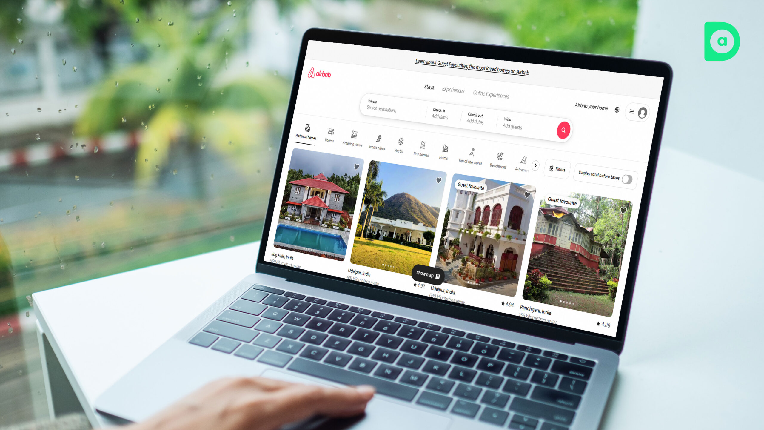
Airbnb is a global platform that connects travelers with hosts who offer unique accommodations and experiences. Its website has a remarkable UI/UX design that facilitates a smooth and enjoyable booking process.
Some of the features and elements that make Airbnb’s website remarkable are:
-
Engaging and Responsive Hero Images
Airbnb uses large and high-quality images that showcase the diversity and beauty of its destinations and properties. It also uses responsive design to ensure that the images fit and adapt to different screen sizes and devices.
-
User-centric Web Design
Airbnb puts the user at the center of its web design by providing various filters, options and tools that help users find and book their ideal stay. It also uses data and AI to suggest relevant and personalized offers and tips to users.
-
Storytelling through Design
Airbnb uses storytelling to connect emotionally with users and inspire them to travel. It features stories and reviews from real hosts and guests, as well as curated collections and guides that highlight the culture and attractions of different places.
3. Medium

Medium is a popular online publishing platform that allows anyone to write and read stories on various topics. Its website is one of the best UI/UX design examples, which promotes a seamless and satisfying reading experience.
Some of the features and elements that make Medium’s website remarkable are:
-
Minimalism and Readability
Medium uses a minimalist and elegant design that eliminates distractions and focuses on the content. It uses white space, simple typography and clear hierarchy to improve the readability and aesthetics of its articles.
-
Interactivity and Feedback
Medium uses interactivity and feedback to enhance the user engagement and satisfaction. It allows users to clap, comment, bookmark and share the articles they like, as well as to follow their favorite writers and topics. It also displays the reading time and progress of each article, as well as the number of views and claps it has received.
-
Content Organization and Discovery
Medium uses a card-based design to organize and display its content in a neat and attractive way. It also uses tags, categories and recommendations to help users discover new and relevant content.
4. Netflix
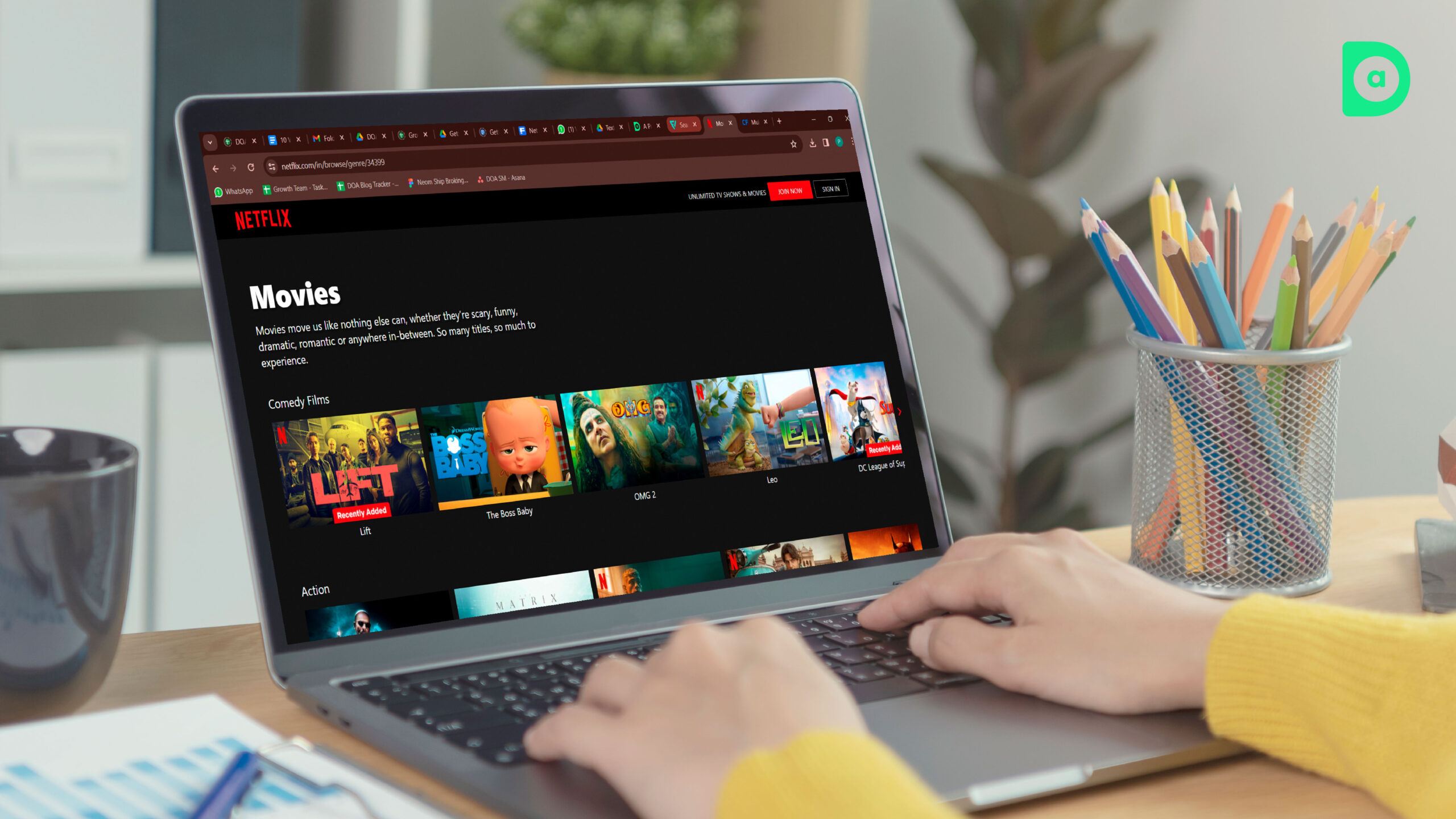
Netflix is a leading streaming service that offers a wide range of movies, shows, documentaries and originals to its users. The Netflix website is one of the best UI/UX design examples, which delivers a captivating and convenient viewing experience.
Some of the features and elements that make Netflix’s website remarkable are:
-
Autoplay Features
Netflix uses autoplay features to grab the users’ attention and entice them to watch more. It automatically plays the next episode of a show, as well as the trailers of the movies and shows that users hover over.
-
Personalization and AI
Netflix uses AI and data to personalize its content and recommendations according to the users’ preferences, history, and ratings. It also creates custom artwork and thumbnails for each user, based on their taste and behavior.
-
Mobile-friendly Layout
Netflix has a mobile-friendly layout that adapts to different screen sizes and orientations. It ensures that the users can enjoy the same features and functionality on their mobile devices as on their desktops.
5. Duolingo

Duolingo is a popular language learning app that teaches users various languages through fun and interactive lessons. Its website is one of the best UI/UX design examples, which motivates and educates users.
Some of the features and elements that make Duolingo’s website remarkable are:
-
Gamification and Microinteractions
Duolingo uses gamification and microinteractions to make learning fun and engaging. It rewards users with points, badges and streaks for completing lessons and challenges. It also uses animations, sounds and feedback to enhance the user interaction and satisfaction.
-
Simplicity and Accessibility
Duolingo has a simple and accessible design that makes it easy for users to start and continue learning. It uses bright colors, cute illustrations and clear icons to create a friendly and inviting atmosphere. It also uses simple language, instructions, and tips to guide users through the learning process.
-
Adaptive and Personalized Learning
Duolingo adapts and personalizes its learning content and methods according to the users’ goals, levels, and progress. It also uses AI and data to provide users with feedback, suggestions, and reminders to help them improve their skills and retention.
6. Slack

Slack is a popular collaboration tool that allows teams to communicate and work together more efficiently. Its website is one of the best UI/UX design examples, which showcases its features and benefits.
Some of the features and elements that make Slack’s website remarkable are:
-
Clear and Catchy Headlines
Slack uses clear and catchy headlines that convey its value
proposition and brand personality. It uses phrases like “Work smarter, not harder”, “The future of work is here”, and “Slack is where work happens” to capture the users’ attention and interest.
-
Interactive and Responsive Design
Slack uses interactive and responsive design to demonstrate its functionality and versatility. It allows users to explore its features and integrations through a live demo, as well as to switch between different devices and screen sizes to see how Slack adapts to them.
-
Social Proof and Testimonials
Slack uses social proof and testimonials to build trust and credibility with users. It features logos and quotes from well-known companies and organizations that use Slack, as well as case studies and stories that highlight the impact and results of using Slack.
7. Apple

Apple is a global leader in technology and innovation that offers a range of products and services to its users. Its website is one of the best UI/UX design examples, which reflects its brand identity and values.
Some of the features and elements that make Apple’s website remarkable are:
-
Minimalism and Elegance
Apple uses a minimalist and elegant design that emphasizes its products and services. It uses white space, simple typography, and subtle animations to create a clean and sophisticated look and feel.
-
3D Graphics and Transitions
Apple uses 3D graphics and transitions to create realistic and immersive visuals on its website. It uses depth, perspective, and movement to showcase its products and features in detail and from different angles.
-
User Engagement and Interactivity
Apple uses user engagement and interactivity to enhance the user experience and satisfaction. It allows users to customize and compare its products and services, as well as to access various resources and support options.
8. TED
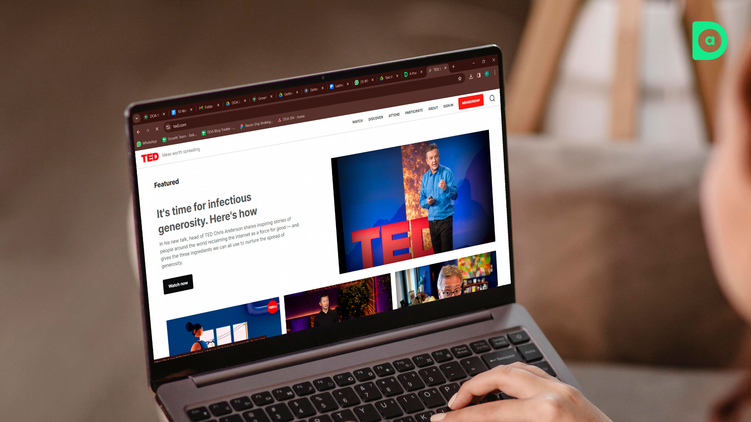
TED is a global platform that shares ideas and stories from various fields and disciplines through talks, podcasts, and books. Its website is one of the best UI/UX design examples, which promotes a seamless and satisfying learning experience.
Some of the features and elements that make TED’s website remarkable are:
-
Content Discovery and Organization
TED uses a card-based design to organize and display its content in a neat and attractive way. It also uses filters, categories, and recommendations to help users discover new and relevant content.
-
User-centric Web Design
TED puts the user at the center of its web design by providing various options and tools that help users enjoy and learn from its content. It allows users to adjust the playback speed, subtitles, and audio quality of its videos and podcasts, as well as to bookmark, download, and share its content.
-
Storytelling and Feedback
TED uses storytelling and feedback to connect emotionally with users and inspire them to learn more. It features stories and reviews from real speakers and listeners, as well as quizzes and surveys that test and improve the users’ knowledge and skills.
9. Mailchimp
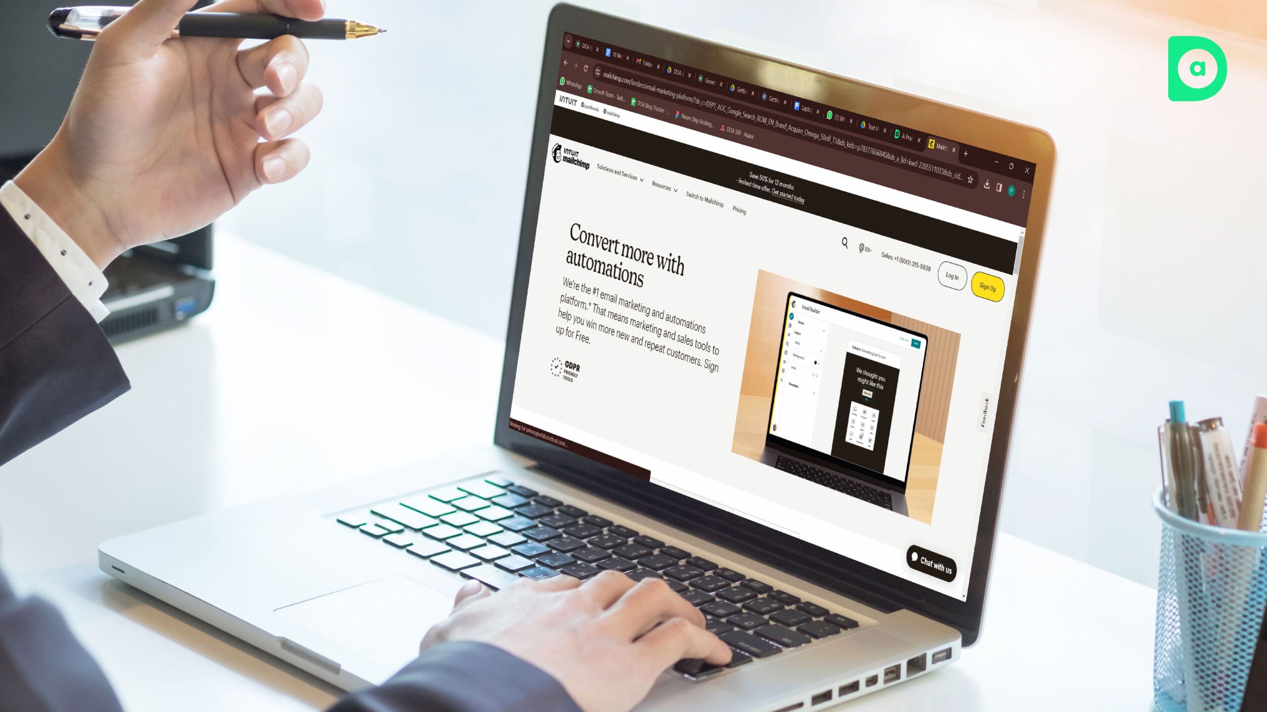
Mailchimp is a popular marketing platform that helps users create and manage email campaigns, landing pages, websites, and more. Its website is one of the best UI/UX design examples, which showcases its features and benefits.
Some of the features and elements that make Mailchimp’s website remarkable are:
-
Colorful and Playful Design
Mailchimp uses a colorful and playful design that reflects its brand personality and values. It uses bright colors, cute illustrations, and humorous copy to create a friendly and inviting atmosphere.
-
User Guidance and Support
Mailchimp uses user guidance and support to help users navigate and use its website. It provides clear and concise instructions, tips, and examples to guide users through the creation and management of their campaigns and projects. It also offers various resources and support options to help users with any questions or issues.
-
Personalization and AI
Mailchimp uses personalization and AI to customize its content and recommendations according to the users’ goals, needs, and behavior. It also uses data and analytics to provide users with insights, feedback, and suggestions to help them improve their performance and results.
10. Dribble
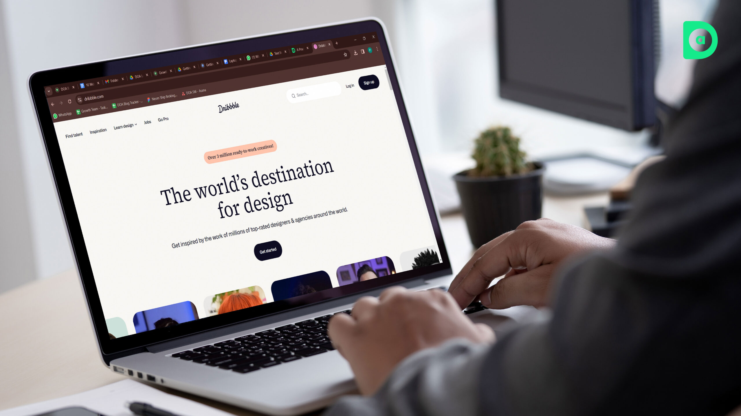
Dribbble is a popular online community and platform for designers and creatives to showcase their work and find inspiration. Its website is one of the best UI/UX design examples, which facilitates a smooth and enjoyable browsing experience.
Some of the features and elements that make Dribbble’s website remarkable are:
-
Grid-based Layout and Infinite Scroll
Dribbble uses a grid-based layout and infinite scroll to display its content in a neat and organized way. It allows users to browse through thousands of designs and projects without having to click on any buttons or links.
-
Interactivity and Feedback
Dribbble uses interactivity and feedback to enhance the user engagement and satisfaction. It allows users to like, comment, follow, and share the designs and projects they like, as well as to contact and hire the designers and creatives behind them.
-
Content Discovery and Filtering
Dribbble uses content discovery and filtering to help users find and explore new and relevant content. It allows users to search and filter the content by keywords, categories, tags, colors, and more.
Conclusion

UI/UX design is a vital component of creating a successful website. It can make your website stand out from the crowd, engage your users, and increase your conversions. In this blog, we have shown you 10 of the best UI/UX design examples that you can learn from and apply to your own projects.
Dad Of Ad is a leading advertising agency in India that specializes in UI/UX design. We have a team of experienced and talented designers who can help you create stunning and successful digital products and services. Whether you need a website, an app, or a campaign, we can help you achieve your goals seamlessly.
If you want to learn more about Dad of Ad’s UI/UX design services, please feel free to contact us.


Leave a Reply